Identity Design: Big Toe Solutions
Big Toe Solutions is a new company dedicated to helping small to medium size businesses get expert help with information security in an approachable, unintimidating way.
To help Bit Toe create an identity and visual brand we first we examined and familiarized ourselves with the information security space. To help the client visualize where in the space Big Toe would fit we put together vision boards that focused on four key areas :
Category Personality. The category of information security is dominated by dark and scary imagery. The norm seems to be to make people afraid of the consequences, rather than focusing on solutions.
Keywords of the category:

- Scary
- Highly Technical
- Intimidating
- Unfriendly
- Complicated
- Dark
Friendly Technology. Next, we explored brands that are doing technology in a friendly, approachable way. While not as technical as the category Big Toe competes in, brands like Nest, Dyson, and MailChimp stand out as good examples of friendly technology.

Keywords of friendly technology:
- Unintimidating
- Empowering
- Simple
- Intuitive
- Trusted
- Loyalty
Competition Study. A look at Colorado firms operating in and around the information security category revealed a more friendly look than the category as a whole, but still left a lot of room for Big Toe to differentiate itself as the friendly and personal alternative.
Keywords of competition:
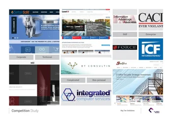
- Corporate
- Technical
- Complicated
- Non-personal
- Stiff
- Enterprise
Big Toe Solutions Brand Personality. We determined that exploring friendly and personal service could range from a look and feel of small town Northern Colorado to nostalgic old fashioned customer service, but needed to still convey professionalism and top tier security capability.
Keywords of Big Toe personality:
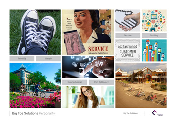
- Friendly
- Simple
- Non-technical
- Fort Collins-ey
- Service oriented
- Inviting
Armed with our research we set out to create an identity for Big Toe Solutions. The key goals were to create a logo that was friendly compared to others in the category, while appearing just as capable. Predetermined company tagline "Every Operation Needs a Big Toe" was also a guiding consideration. Call outs in the image below detail how these goals were met.

Anatomy of the Big Toe Solutions logo.
The image below shows how the identity works in real world applications such as letterhead and business cards.

Identity Design for Big Toe Solutions by Clark Peak Design